

FM Immobilier
LOGO + BUSINESS CARDFM Immobilier & Patrimoine is a real estate agency located in the south of France seeking for a brand identity.

I designed the logo using the the founder's monogram, the letters F and M in an angle shaping a roof or a house. The serif font chosen represents professionalism and stability, in contrast with the rest of the layout inspiring modernity.

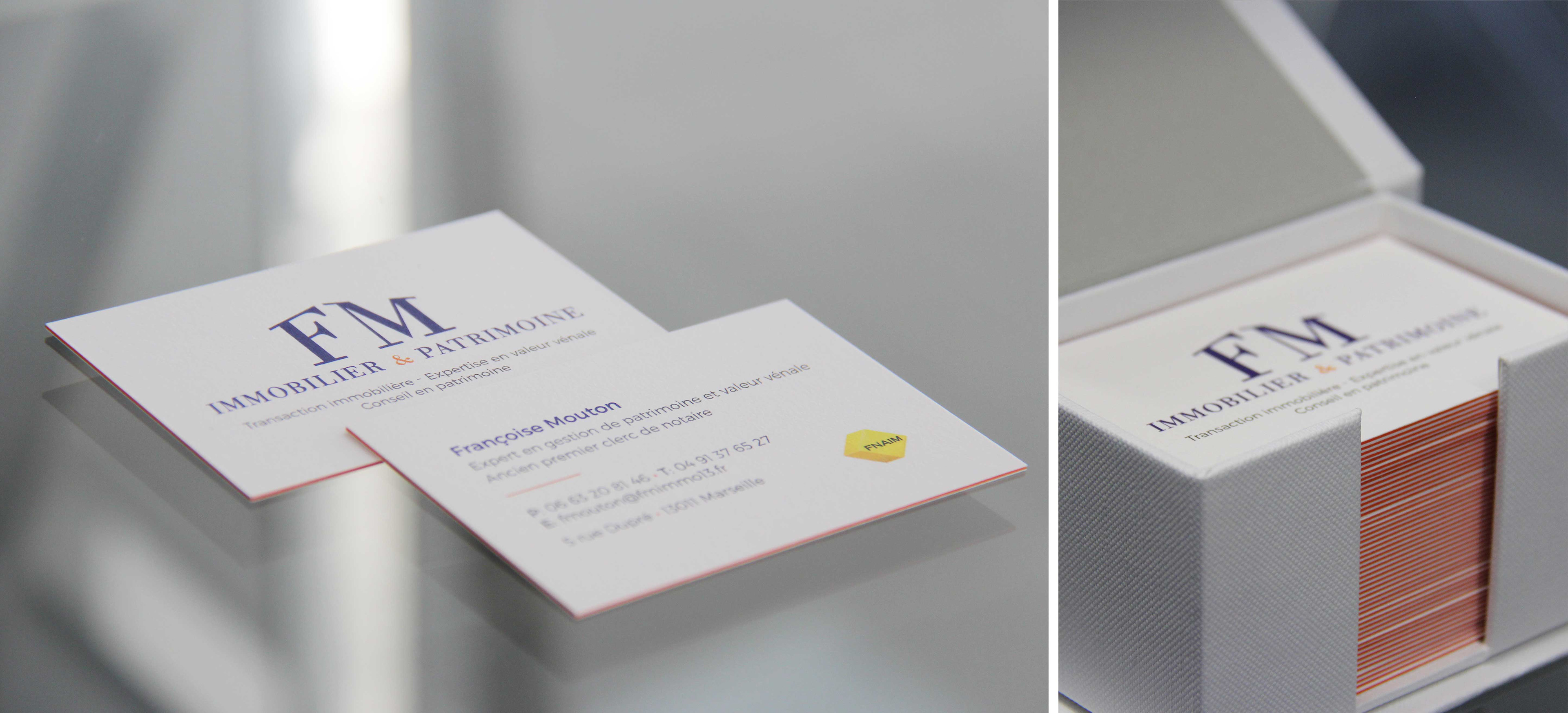
The business cards are made with multiple layers of paper to show the orange color in a subtle way.
